PALE HORSE COFFEE CO.
Branding · Packaging · Campaign
objective
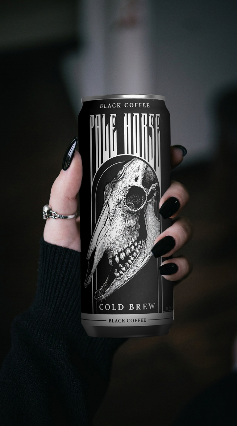
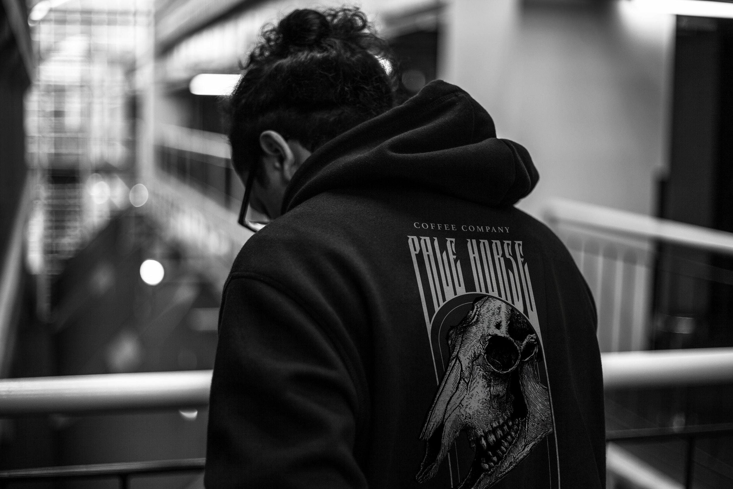
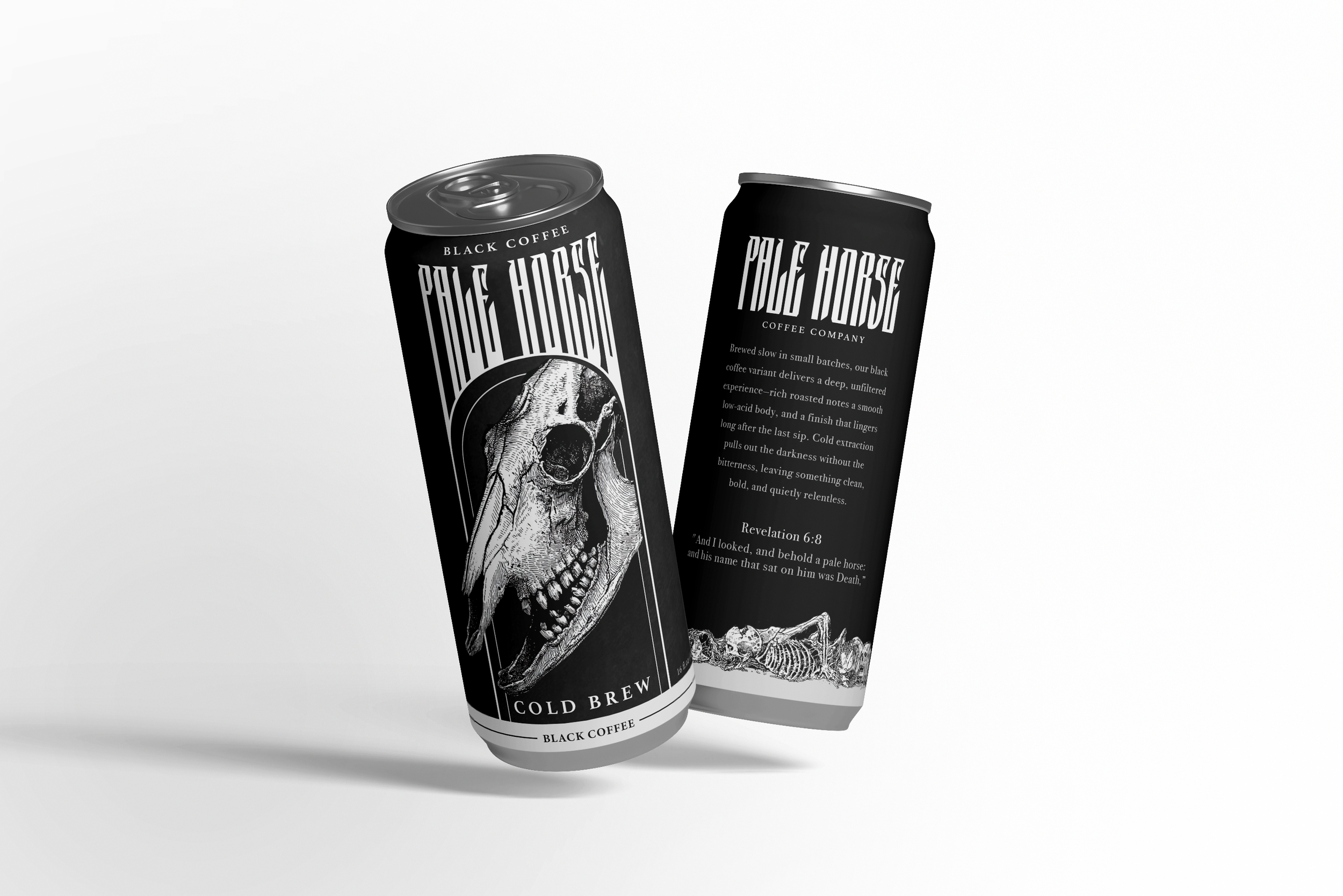
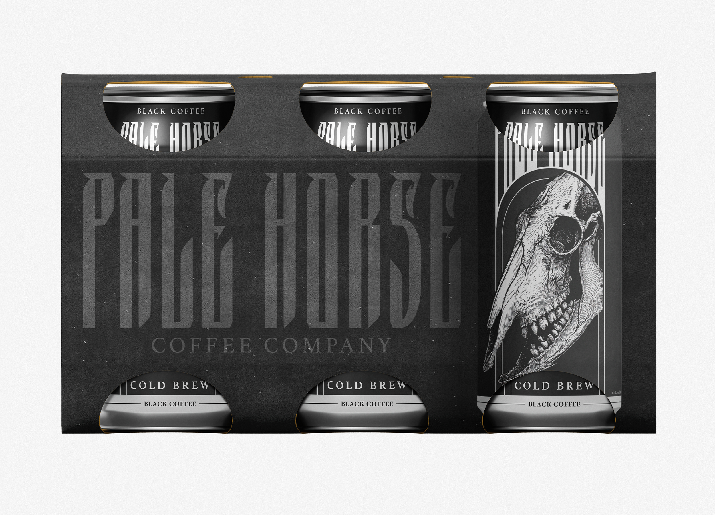
Pale Horse is a cold brew brand built for the counterculture audience, people looking to defy the norms of bright, cheerful morning coffee. The brand leans into apocalyptically gothic aesthetics that maintain a sense of class and dooming charm, drawing from a visual world that is only growing in cultural relevance.
Process
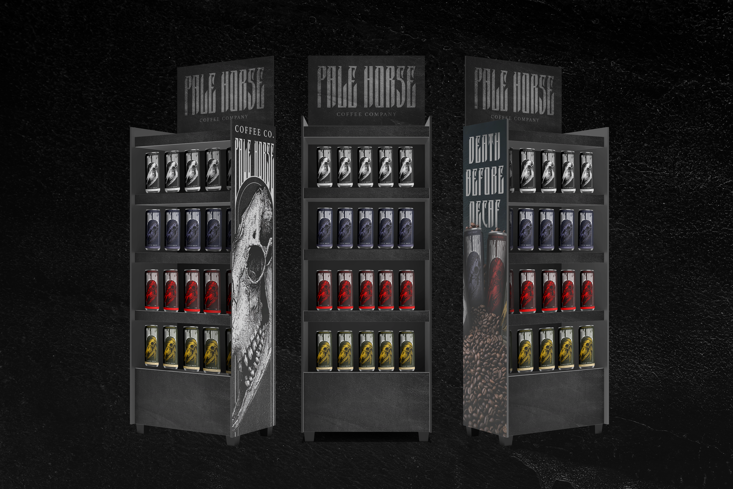
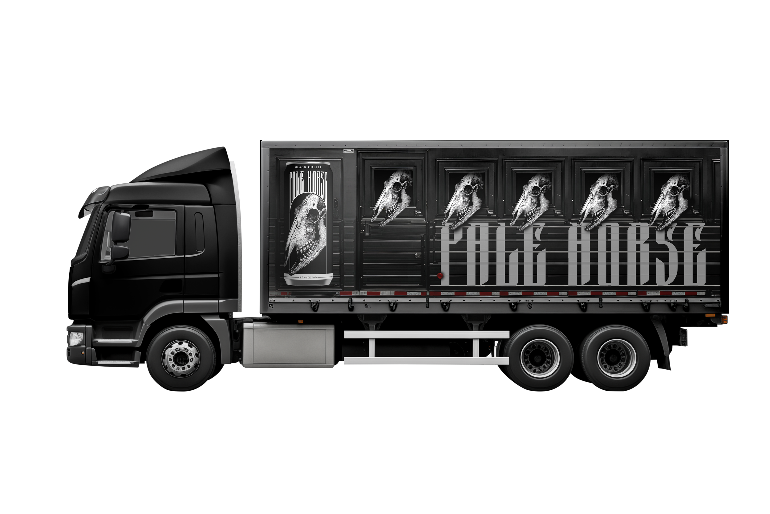
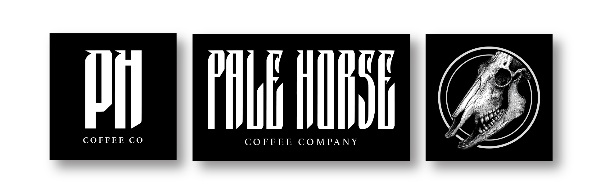
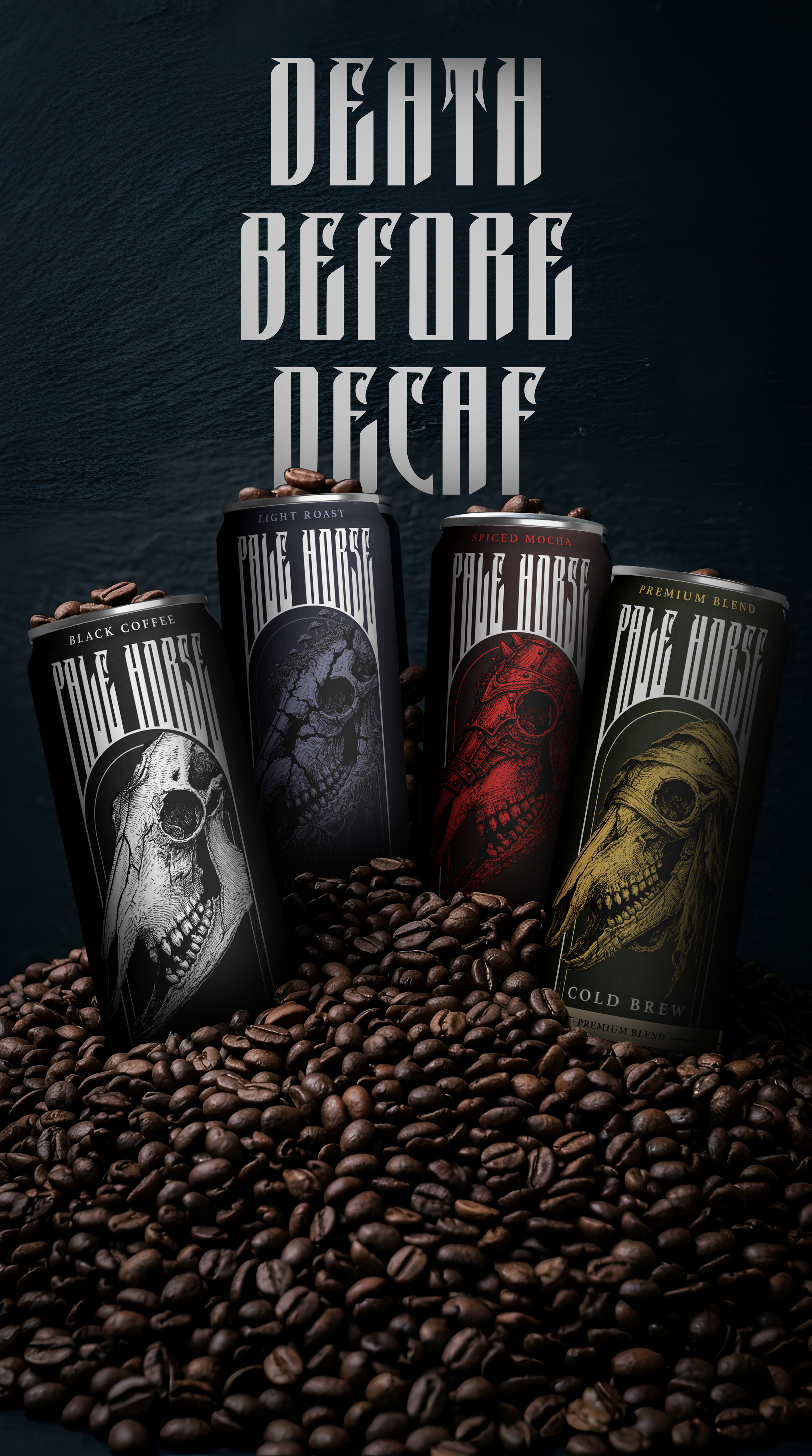
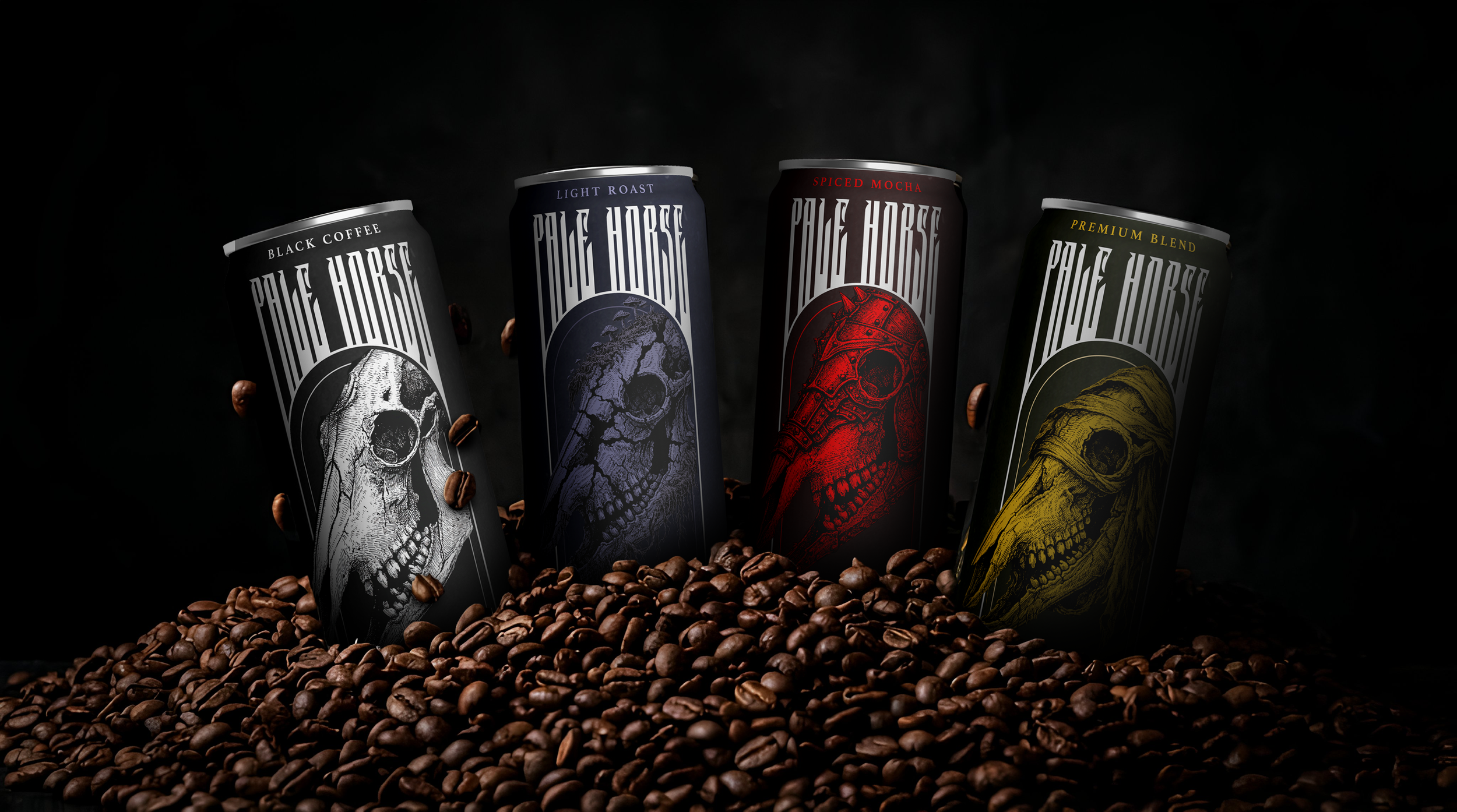
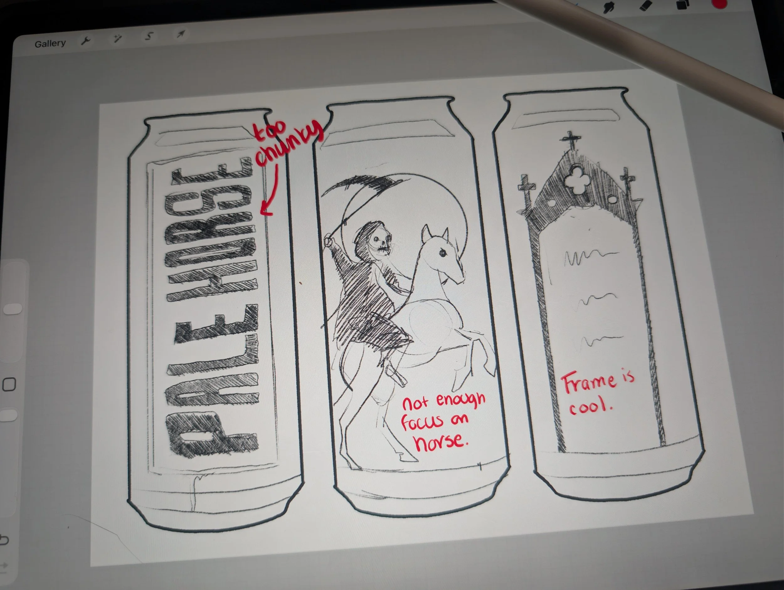
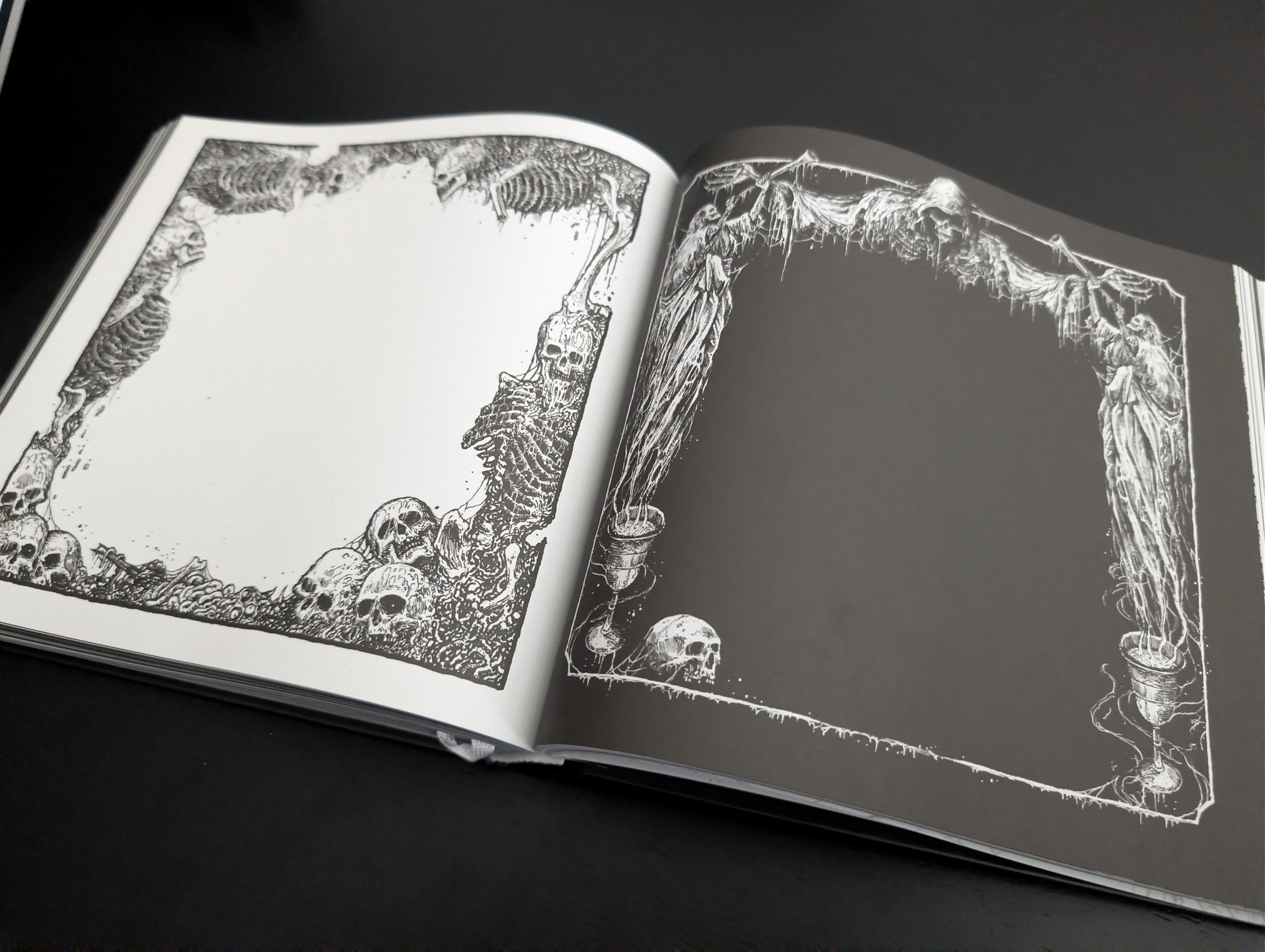
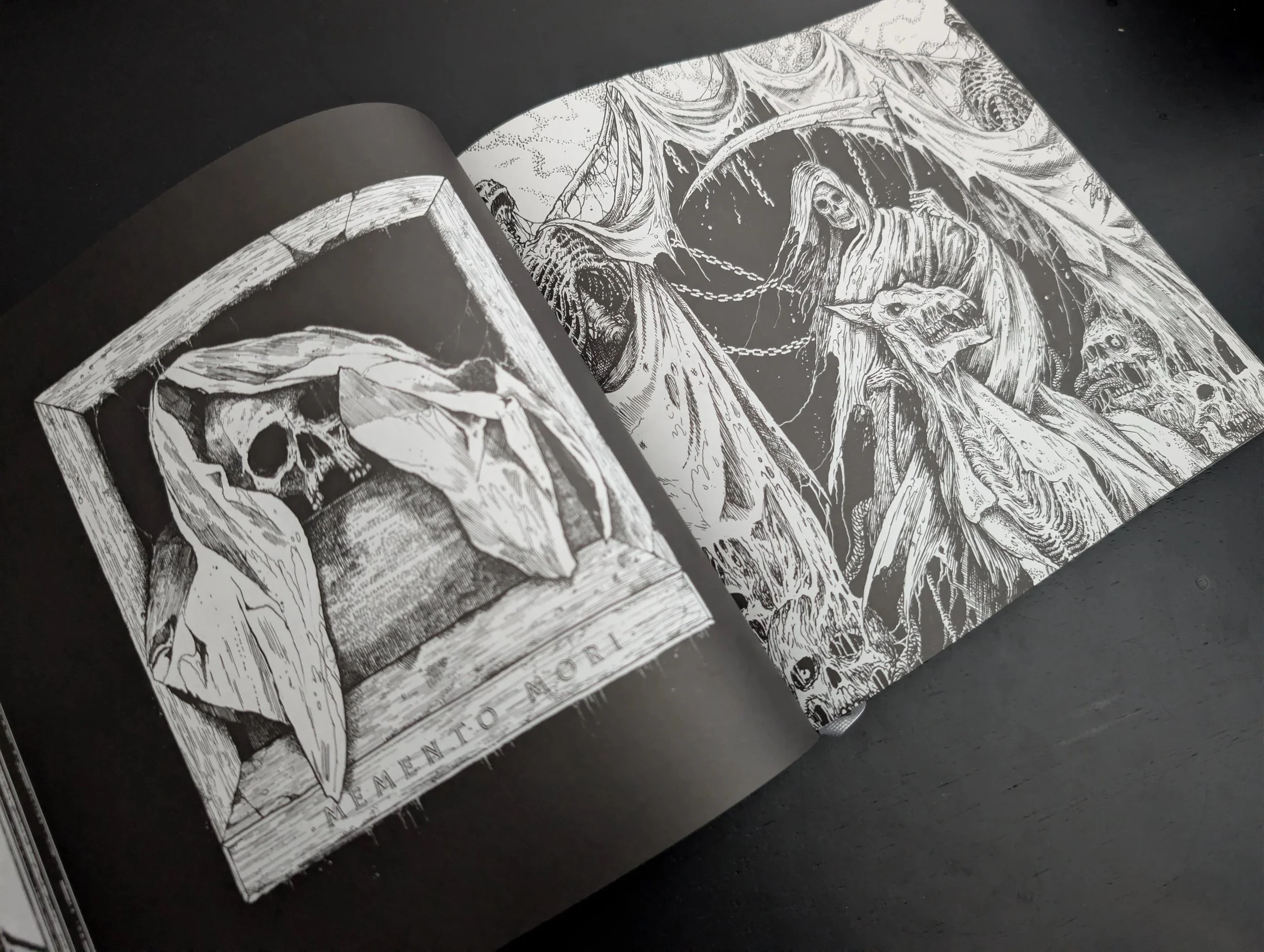
The work started with deep study of brands already loved by this audience. What emerged was a clear pattern: glamour in the goth. Sleek typography, high contrast pen and ink illustration, and an undeniable mood. After several rounds of iteration the work landed on a visual language striking enough to carry through every touchpoint in the retail space.
Results
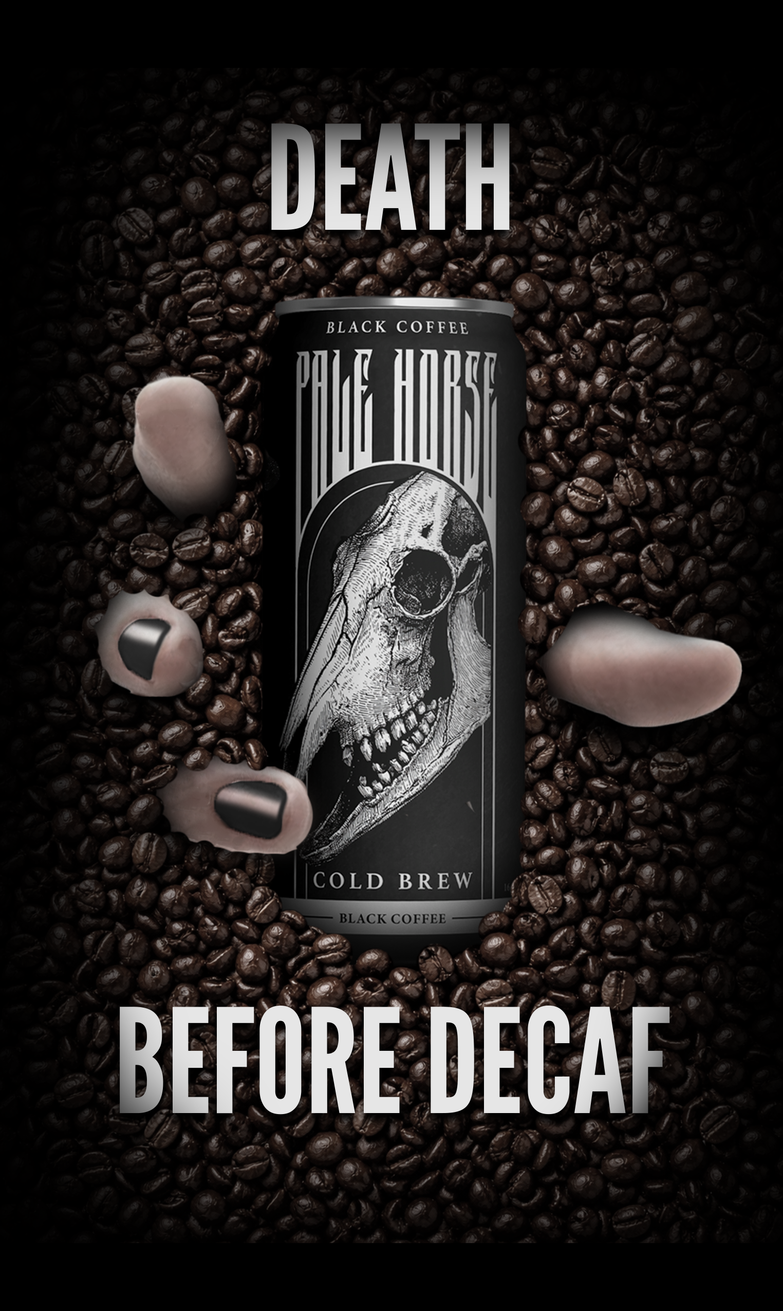
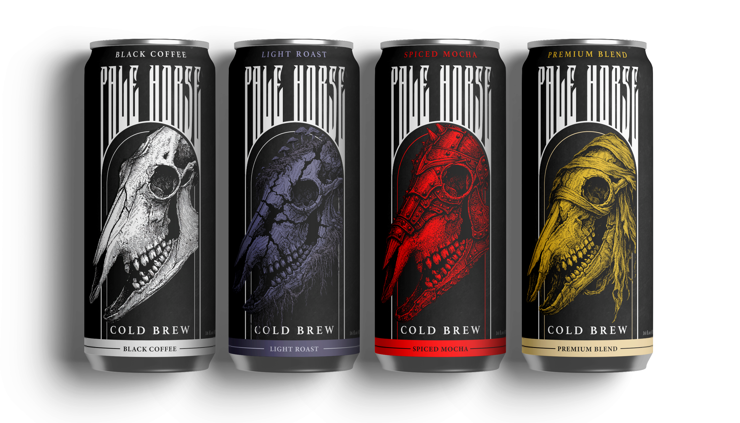
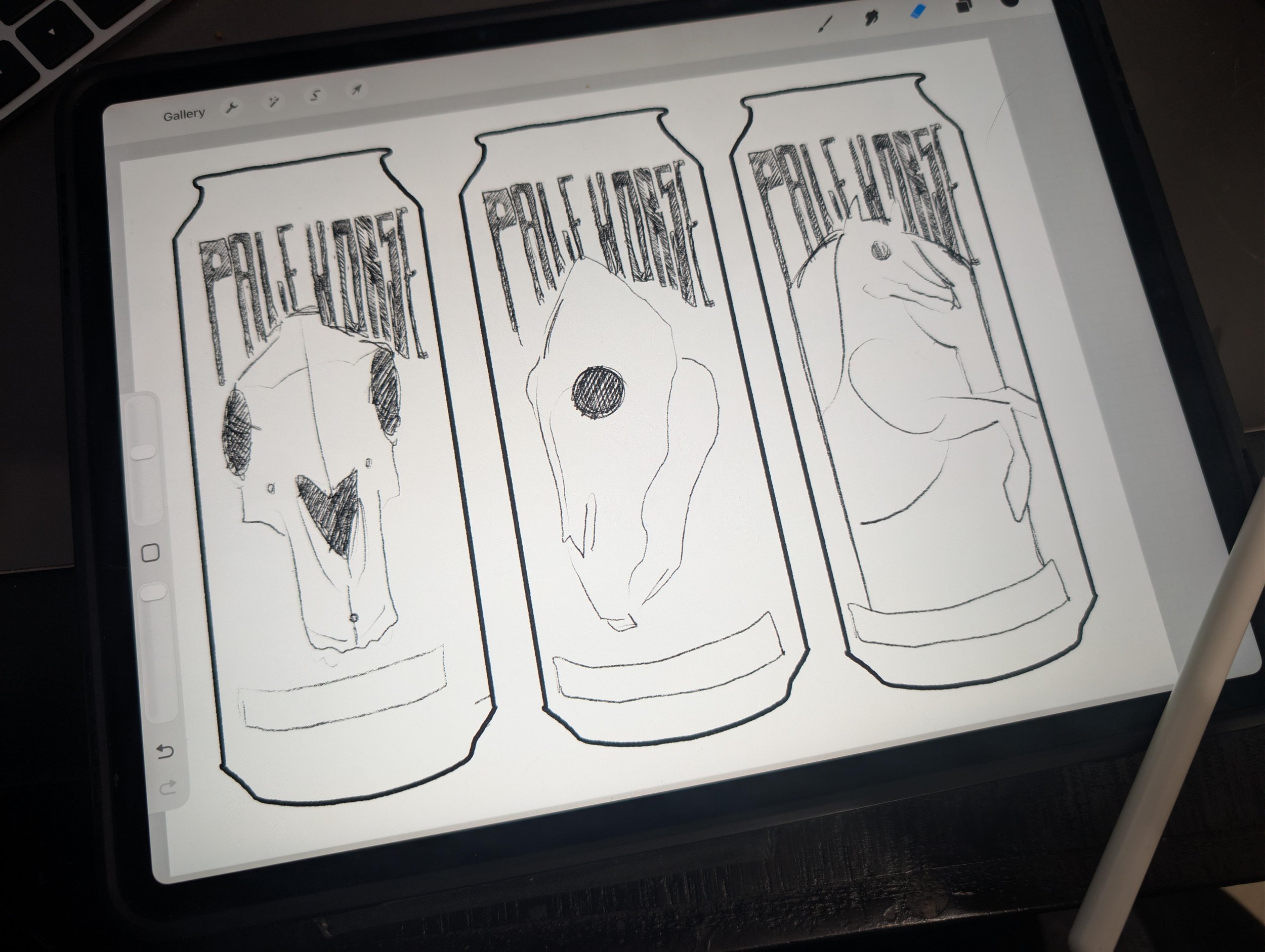
A complete brand system spanning logo, packaging, environmental, and campaign, anchored by the tagline Death Before Decaf. The four-SKU variant lineup functions as a collectible series while reading cohesively as a family on shelf. Beyond the can, the identity carries enough cultural weight and visual consistency to grow into a full lifestyle brand, with natural extensions into apparel, merch, and experiential spaces.